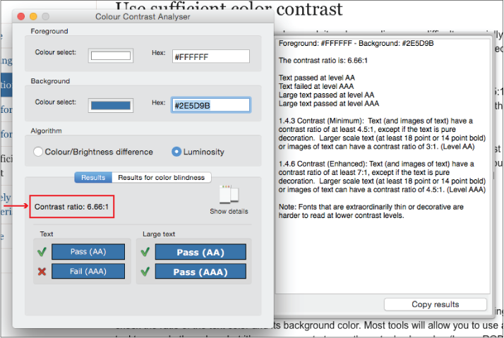
When text contrasts poorly with its background, it makes reading more difficult, especially for people with low vision. The same goes for icons and situations where highlighting is used to draw attention (such as the hover effects on links).
This example shows two color combinations: one that has a low contrast ratio and one that has a high contrast ratio.

- Use sufficient contrast. Make sure that the contrast ratio between text color and background color is at least 4.5:1. There are color-contrast tools that can help you test color pairs for contrast and adjust the values as necessary.
- Avoid very high contrast. Be aware also that for some people, especially people with dyslexia, a very high contrast color scheme can make reading more difficult. It’s a good idea to choose an off-white background color rather than a white background to aid on-screen reading.
Testing
Check text and background color combinations on the page, using a color contrast checking tool:
- Is the contrast ratio at least 4.5:1 (or 3:1 for large text)?
